RESPONSIVE SITES ARE THOSE THAT ADAPT THEIR CONTENT ACCORDING TO THE DEVICE used for their viewing, where the most common are: computers and notebooks, also called desktop, cell phones, tablets and tvs.
Among the most popular devices, computers were the first devices to receive browsers and websites, currently their popularity has a majority only in very specific branches, and viewing on mobile phones already occupies a space of half or more of all navigation. Devices such as tablets and TVs correspond to a very low percentage.
In addition to the content being adjusted for each interface, it is also important that the DEVELOPMENT OF RESPONSIVE SITES meets some important technical requirements, for example, cell phones use data connections that are mostly limited, so the website needs to be much lighter than on computers. We know that websites that take more than 2 seconds to load on cell phones have a very high rejection, given the importance of meeting the requirements of each device.
In addition to the importance of technology in the development of responsive websites, it is very important to test all the components used in several different resolutions and make sure that their operation communicates correctly with the navigation.
The responsive website needs, in a way, to accordion its content to adapt to the device, reordering and omitting specific information from different devices. Currently, we can consider, in DEVELOPMENT OF RESPONSIVE SITES, the following resolutions:
- Extra large resolutions, which are 1200px or more.
- Large resolution with more than 992 pixels.
- Medium resolutions, with more than 768 pixels.
- Small resolutions, over 576 pixels.
- Very small resolutions, less than 576 pixels.
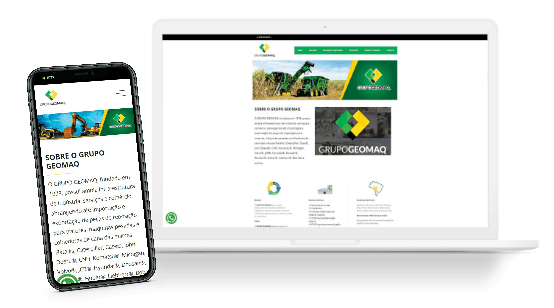
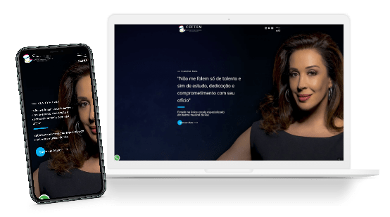
Cell phones use very small or small resolutions, for the most part, given the small sample space on the screen, the content will probably all be concatenated one above the other. Responsive website development is a great option for creating institutional websites for companies, as their cost is reduced compared to developing multiple websites for each different device.
We at ECO WEBDESIGN are specialists in RESPONSIVE WEBSITE DEVELOPMENT with over 10 YEARS of experience in websites for companies that want to make their websites machines for receiving contacts. Contact us for more information.


